Building a React Native Component Library with Storybook.JS
— JavaScript, Documentation, Software Development — 4 min read

I’ve been working with a legacy React Native code base for the past couple of months and one of the bigger issues I faced working with the code base was that there was no clear separation of concerns of the different UI components.
Instead of having separate, testable components for a cell, row, and table to render a table of data there was a single component with the render function creating those smaller components to build up the bigger one.
This being the case one of the jobs I’m currently doing is creating these separate components and making the pure components — that is a component that does not have any internal state.
To make the code base easier to work with I’ve abstracted these smaller pure components into their own library that will contain its own documentation and test and allows the core app to focus on handling state and providing data to the pure components to render.
This approach also allows another team to focus purely on the UI and UX aspects of the app and with an established contract of what props the components expect there should be no issues integrating these changes into the main application.
To help with building shared understanding between the UI development and app development teams I’ve used Storybook.js to render the components as an interactive styleguide.
Setting up the component library
The library is a new npm project but it will ultimately be used by the main application so there’s a few things to consider:
- The version of React used in the main application (add this as a peer dependency)
- The lifecycle management used in the main application (3rd party components may cause issues)
- As the main app is a private app, how can the library be installed without uploading to the public npm repo
Creating a new React Native project
In order to start building the library I needed to set up a new React Native project.
To do this I used create-react-native-app (after installing it globally) which gave me my base project to work from.
I also installed the Expo CLI tools in order to run the app using Expo as the component library currently doesn’t use non-JS code.
Once I had an example React Native app running it was time to start setting up storybook.
Adding Storybook
The easiest way to set up storybook is to install the Storybook CLI globally and then run the getstorybook command which does all the hard work setting up Storybook for your project for you.
I then just had to add export default from './storybook'; to App.js and Expo took care of the rest when I ran the app.
Adding components
Once I had Storybook up and running I could then add the components.
My goals with the component library were to create pure stateless components, as these are far easier to test and make composition easy.
I created a src folder for the components which will be the folder packaged up when creating the library and added my first component.
1import { TextInput, View, StyleSheet } from 'react-native';2import React from 'react';3import PropTypes from 'prop-types';4
5/**6 * Styles to use for Pokemon Picker Input7 */8const styles = StyleSheet.create({9 searchView: {10 padding: 5,11 backgroundColor: '#e4c049',12 },13 searchTextInput: {14 fontSize: 18,15 color: 'white',16 padding: 10,17 },18});19
20/**21 * Input to filter the Pokemon Picker list22 *23 * @param {Function} onSearchTextChange - Function to call on input value changing24 * @returns {View} Text Input in View25 * @class26 */27const Input = ({ onSearchTextChange }) => (28 <View style={styles.searchView}>29 <TextInput30 placeholder="Search pokemon..."31 style={styles.searchTextInput}32 underlineColorAndroid="transparent"33 selectionColor="#575757"34 placeholderTextColor="#575757"35 onChangeText={onSearchTextChange}36 />37 </View>38);39
40/**41 * Properties used to render the component42 *43 * @type {{onSearchTextChange: Function}}44 */45Input.propTypes = {46 onSearchTextChange: PropTypes.func.isRequired,47};48
49export default Input;I then created a __tests__ folder at the root level and created a snapshot test for that component to validate the render logic.
1import React from 'react';2import renderer from 'react-test-renderer';3import Input from '../../../../src/components/inputs/pokemonPicker/Input';4
5describe('PokemonPickerInput', () => {6 it('Renders the component', () => {7 const tree = renderer.create(<Input onSearchTextChange={jest.fn()} />)8 .toJSON();9 expect(tree).toMatchSnapshot();10 });11});Finally I created a story for the component that would be displayed in Storybook that shows the component.
1import { Input } from '../../../src/components/inputs/pokemonPicker';2
3storiesOf('PokemonPicker', module)4 .add('Search Input', () => (5 <WrapperView>6 <Input onSearchTextChange={(text) => console.log(text)}/>7 </WrapperView>8 ));
Improvements to the process
As I started building up the component library I found a few ways to improve the process.
To reduce the amount of duplicate code in the tests and storybook I decided to use storyshots — an addon for Storybook that takes care of the snapshot tests.
I’m not entirely sure that Storyshots is the right approach however as it bundles all the snapshots into one big file and I’d prefer more control over this so there’s a clear mapping between the component under test and the snapshot file.
To help with testing and displaying the components in Storybook I created a data folder that contains data objects to pass to components.
This allowed me to have one place where all the data could live and then import the objects I needed to use in my tests and stories.
Dealing with Modals
One of the harder to solve issues was how to display a Modal component as a Modal will overlay over the Storybook UI and if there’s no means to manage the visibility state it makes Storybook un-usable.
Adding this type of functionality to a story isn’t as simple as declaring a boolean variable to hold the value and changing that via functions as Storybook will not re-render the component when the value changes. Instead you need a state management addon to hold the value.
There are two state addons for Storybook dump247/storybook-state and sambego/storybook-state.
I found that the dump247 ran into a bug where due to a race condition in the React Native version of Storybook it was trying to access a value that wasn’t set yet and blew up, but the sambego/storybook-state addon works a charm.
Using the storybook-state addon I was able to create an initial button component that on being clicked presented the Modal component and then I could dismiss the Modal on pressing the close button.
1import React from 'react';2import { Button } from 'react-native';3import { storiesOf } from '@storybook/react-native';4import { State, Store } from "@sambego/storybook-state";5import { Modal, Cell, Row, Input, List } from '../../src/components/inputs/pokemonPicker';6
7const store = new Store({8 visible: false9});10
11const pokemonList = [12 {13 name: 'haunter',14 number: 93,15 images: {16 animated: 'https://assets.com/img/pokemon/animated/haunter.gif',17 large: 'https://assets.com/img/pokemon/icons/96x96/93.png',18 small: 'https://assets.com/img/pokemon/icons/16x16/93.png'19 },20 types: {21 primary: {22 color: {23 inside: 'b48fc1',24 outside: '46345e'25 },26 font: 'ffffff',27 name: 'ghost'28 },29 secondary: {30 color: {31 inside: 'a6b8c3',32 outside: 'a27498'33 },34 font: 'ffffff',35 name: 'poison'36 }37 }38 }39];40
41
42const rowOfPokemon = () => (43 <Row index={0}>44 <Cell index={0} />45 <Cell index={1} pokemon={pokemonList[0]} />46 </Row>47);48
49storiesOf('Inputs', module)50 .add('Pokemon Picker', () => (51 <State store={store}>52 <Button title={'Press to launch modal'} onPress={() => store.set({visible: true})} key={0} />53 <Modal closeFunction={() => store.set({visible: false})} visible={store.get('visible')} key={1}>54 <Input onSearchTextChange={(text) => console.log(text)}/>55 <List renderRow={rowOfPokemon} pokemon={[93]}/>56 </Modal>57 </State>58 ));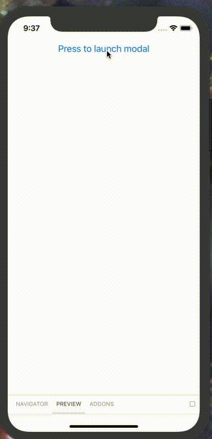
Summary
By abstracting the UI components into a library I’ve been able remove a large part of the complexity of the original code base as well as make both the UI component and main application code bases more focused, due to a separation of concerns.
Additionally the fact that the UI components now have a separate place to live with their own means of displaying them outside of the main application’s state has meant that team members with a more design-based background feel free to experiment with the UI without having to worry about breaking the main application.