Building a user journey map using Figma, Konva & react-konva
— JavaScript, Software Development — 3 min read
As part of an upcoming product that I’m working on (reciprocal.dev if you want to sign up early) I’ve been looking at how to render a user journey map on a webpage.
I’ve created maps before in tools like Miro and Figma but never had to put much thought into the code that sits behind these tools — turns out thanks to Konva (and react-konva) this is actually pretty simple to do.
While this might not be the final solution I use, this approach is a nice introduction into how to use SVG to create the objects in a design program and render them to a canvas in the browser.
Creating the user journey map
For my example user journey I’ll pick using JiffyCV (another app I’ve built) to create and print a CV.
Adding screens
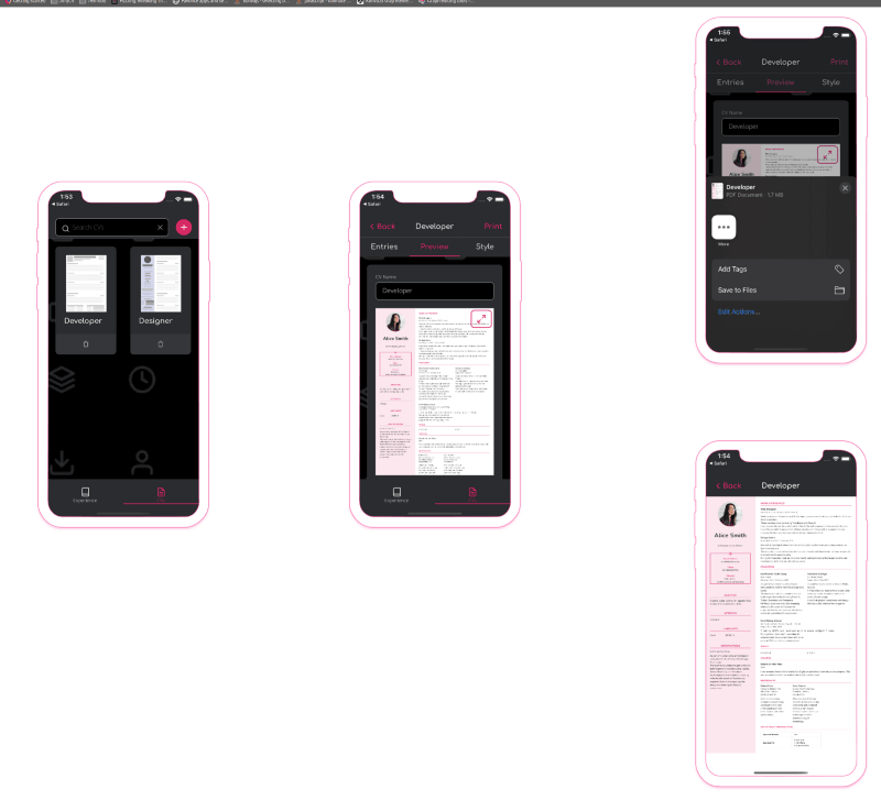
In order to create the map I dragged the screens from the app into Figma and created a vector outline of an iPhone 11 around them by grabbing a .png from the Apple developer website and tracing the outer and inner outlines.
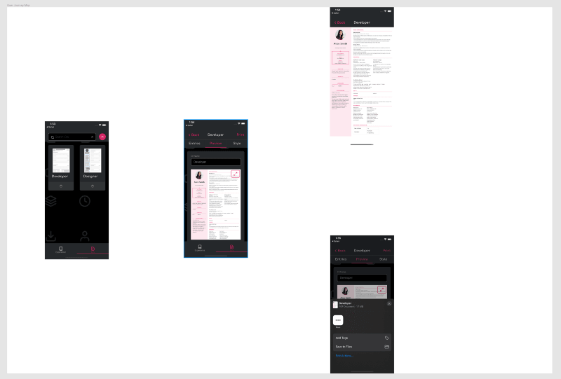
I had some issues with Figma extracting the inner outline from the outer in order to create one path so I used Adobe Illustrator to do this before pasting that into Figma.
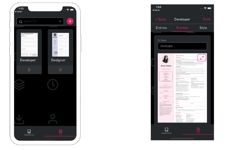
I then applied some styling to the device outline so it looked a little less flat and applied this same outline to the other screens.
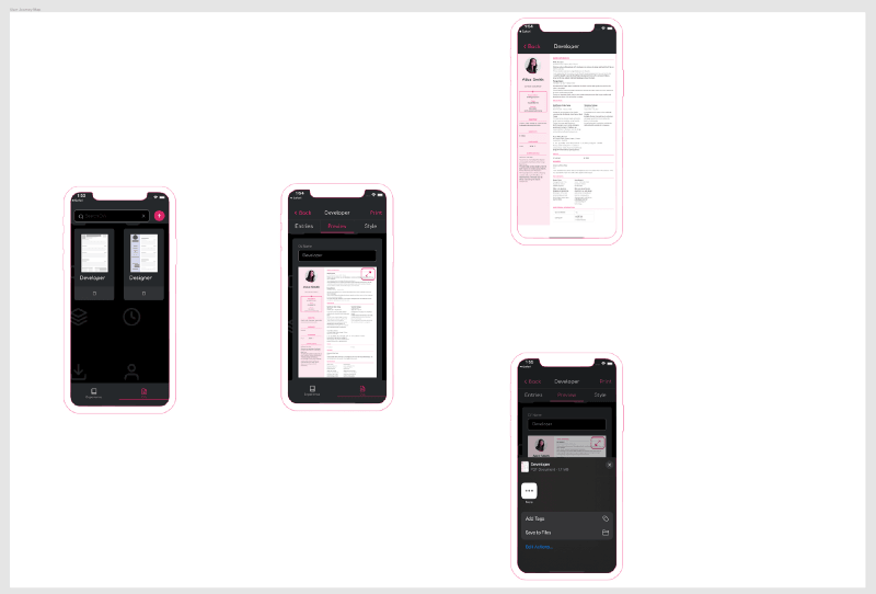
Linking everything up
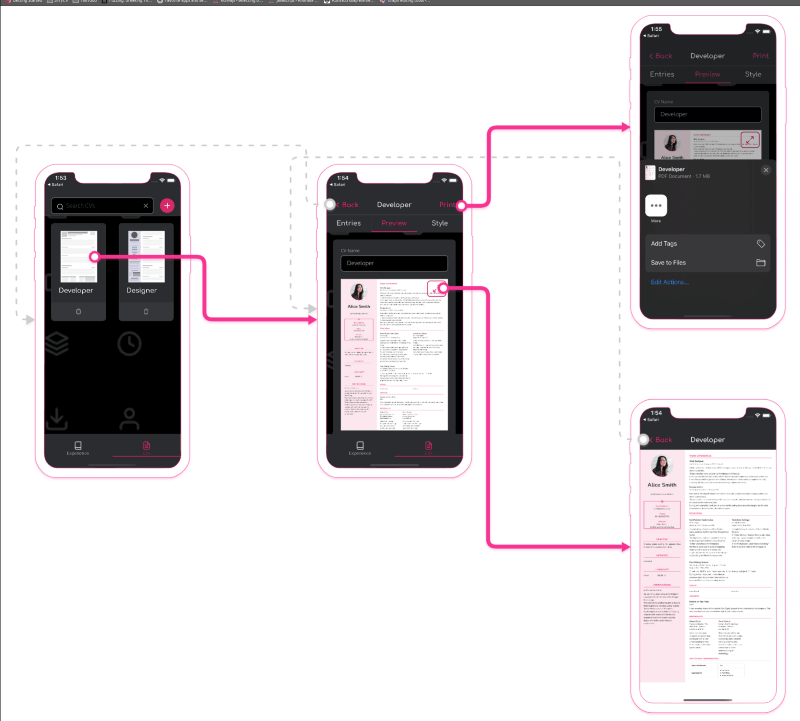
The next step was to add connections between the parts of the screen’s UI and where that would take the user, as the example user journey is pretty simple this wasn’t too hard but as things scale up this could get a bit messy.
To create these links I decided on two different connection types; a positive connection that moves the user towards the end goal and a negative connection that takes the user back away from the end goal.
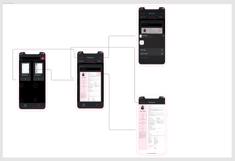
I then used the pen tool in Figma to draw the lines between the screens and added caps to the start and end of the line to indicate the direction of the flow.
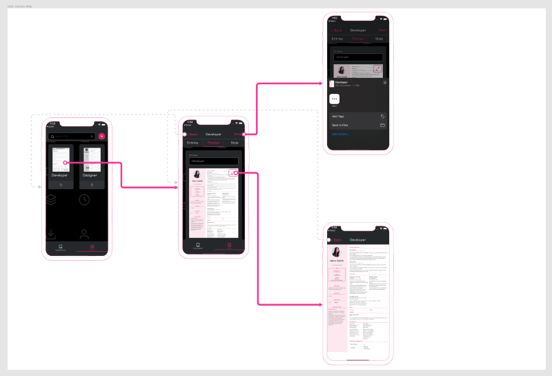
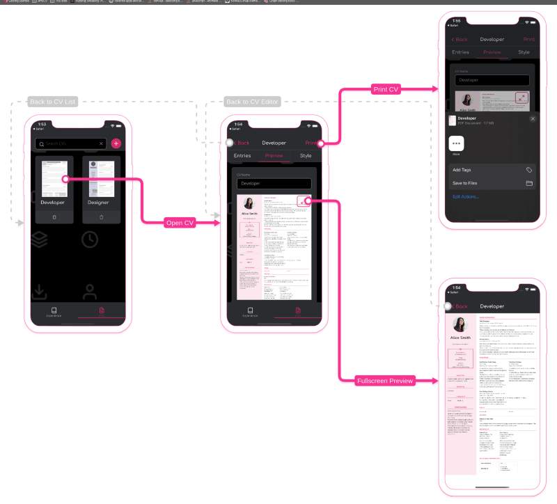
I then added rectangles to the line which text would sit on to act as a label to explain what the connection represented.
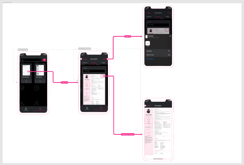
Recreating the user journey map with Konva
As I like to use React I chose to use the react-konva library but this approach should work for any implementation of Konva.
Building a device screen component
Just like with the user journey map in Figma I decided to focus on the device screens first.
To create the component I exported the device outline object to an SVG file and used the data attribute of the path (called d) to recreate the path in Konva’s Path component.
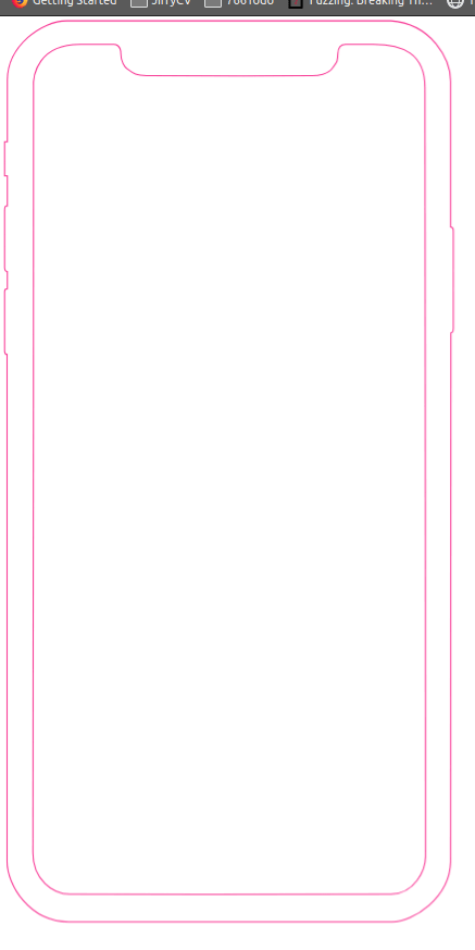
As Konva follows SVG’s layering convention (top item gets rendered first) I then added the image for the screen above the outline path, this means the outline would be shown on-top of the image.
To load the image into Konva I used the use-image hook which makes it easy to load external images into Konva and rendered that image into Konva’s Image component.
Finally I exported just the outer outline of the device from Figma and added this above the image so I could use this to apply the drop-shadow. Konva, unlike SVG doesn’t require a complex filter set up to achieve a drop-shadow and instead you supply parameters for the shadow as props on the Path component.
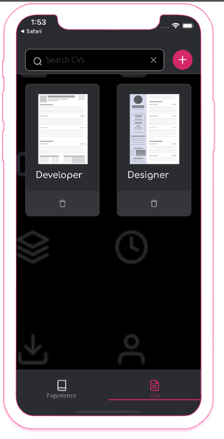
In order to make the component easy to re-use I then exposed some props such as image url, outline colour and X & Y positioning and used these to create the set of screens as I had it in Figma.
1import { Path, Group, Image } from 'react-konva';2import useImage from 'use-image';3
4const deviceOutlinePath = ''; // removed for brevity5const deviceBodyPath = ''; // removed for brevity6
7function DeviceScreen({ imageUrl, x, y }) {8 const [image] = useImage(imageUrl);9 const xPos = x + 15;10 const yPos = y + 12;11 12 return (13 <Image14 image={image}15 height={379}16 width={175}17 x={xPos}18 y={yPos}19 />20 )21}22
23export function Device({ x = 0, y = 0, imageUrl, colour = '#F73492' }) {24 return (25 <Group26 x={x}27 y={y}28 >29 <Path30 x={x}31 y={y}32 height={406}33 width={205}34 shadowColor={colour}35 shadowOffsetY={2}36 shadowOffsetX={0}37 shadowBlur={2}38 shadowOpacity={0.25}39 fill='white'40 data={deviceOutlinePath}41 />42 <DeviceScreen imageUrl={imageUrl} x={x} y={y} />43 <Path44 x={x}45 y={y}46 height={406}47 width={205}48 fill='white'49 data={deviceBodyPath}50 />51 <Path52 x={x}53 y={y}54 height={406}55 width={205}56 stroke={colour}57 strokeWidth={0.5}58 data={deviceOutlinePath}59 />60 </Group>61 )62}Building the connections
I followed a similar approach to create the connections, although this required more exporting than the device screen due to the paths being unique but there was only five connections to deal with so this wasn’t too taxing.
I decided that I would have one component deal with both positive and negative connections as the only difference between the two was the styling and the placement of the cap elements.
To create the component, I added a path for which I would use the data attribute from the exported lines to define the connection’s shape and added a circle and triangle for the caps.
I then added some logic to the component to handle different styling and cap placement for the positive and negative lines and added props to allow the lines data, connection type, colour and X & Y position.
1import { Path, Circle, Group, Rect, Text } from 'react-konva';2
3function ConnectionSource({ colour='#F73492', x = 0, y = 0 }) {4 return (5 <Circle6 x={x}7 y={y}8 radius={6}9 fill='white'10 stroke={colour}11 strokeWidth={3}12 shadowColor={colour}13 shadowOffsetY={2}14 shadowOffsetX={0}15 shadowBlur={2}16 shadowOpacity={0.25}17 />18 )19}20
21function ConnectionTarget({ colour='#F73492', x = 0, y = 0 }) {22 return (23 <Path24 x={x}25 y={y}26 fill={colour}27 data='M229 7.5L217.75 13.9952V1.00481L229 7.5Z'28 shadowColor={colour}29 shadowOffsetY={2}30 shadowOffsetX={0}31 shadowBlur={2}32 shadowOpacity={0.25}33 />34 )35}36
37function ConnectionLabel({ text = '', x = 0, y = 0, colour, width}) {38 const labelText = (39 <Text40 x={5}41 y={5}42 text={text}43 fontSize={12}44 fill='white'45 />46 )47 return (48 <Group x={x} y={y}>49 <Rect50 x={0}51 y={0}52 fill={colour}53 height={20}54 width={width}55 cornerRadius={4}56 />57 {labelText}58 </Group>59 )60}61
62function getProgressStyleProps(colour) {63 return {64 stroke: colour,65 strokeWidth: 5,66 shadowColor: colour,67 shadowOffsetY: 2,68 shadowOffsetX: 0,69 shadowBlur: 2,70 shadowOpacity: 0.2571 }72}73
74function getRegressStyleProps(colour) {75 return {76 stroke: colour,77 strokeWidth: 2,78 dash: [5, 10]79 }80}81
82export function Connection({ colour='#F73492', x = 0, y = 0, path, capX, capY, type = 'progress', label, labelX, labelY, labelWidth }) {83 const styleProps = type === 'progress' ? getProgressStyleProps(colour) : getRegressStyleProps(colour);84 return (85 <Group>86 <Path87 x={x}88 y={y}89 data={path}90 lineCap='round'91 lineJoin='round'92 {...styleProps}93 />94 <ConnectionTarget colour={colour} x={capX} y={capY} />95 <ConnectionSource colour={colour} x={x} y={y} />96 <ConnectionLabel text={label} x={labelX} y={labelY} colour={colour} width={labelWidth} />97 </Group>98 )99}Layers
As well as ordering the components in the order you want them shown you can also create separate layers in Konva so that you can treat each class of component differently.
I decided to separate the device screens and the connections into separate layers to keep things clean.
1import { Stage, Layer } from 'react-konva';2import { Device } from './Device';3import { Connection } from './Connection';4 5function App() {6 return (7 <Stage width={window.innerWidth} height={window.innerHeight}>8 <Layer id='screens'>9 <Device imageUrl={`${process.env.PUBLIC_URL}/9-multiple-cvs.png`} x={20} y={100} />10 <Device imageUrl={`${process.env.PUBLIC_URL}/1-create-cv.png`} x={200} y={100} />11 <Device imageUrl={`${process.env.PUBLIC_URL}/3-print-cv.png`} x={400} y={5} />12 <Device imageUrl={`${process.env.PUBLIC_URL}/2-cv-preview.png`} x={400} y={250} />13 </Layer>14 <Layer id='connections'>15 <Connection y={253} x={420} capX={-185} capY={393} path='M0 0 H-50 q -10 0 -10 -10 V-65 q 0 -10 -10 -10 H-390 q -10 0 -10 10 V137 q 0 10 10 10 H-387' colour='#CCCCCC' type='regress' label='Back to CV List' labelX={50} labelY={168} labelWidth={93} />16 <Connection y={553} x={820} capX={175} capY={379} path='M0 0 H-20 q -10 0 -10 -10 V-365 q 0 -10 -10 -10 H-433 q -10 0 -10 10 V-177 q 0 10 10 10 H-423' colour='#CCCCCC' type='regress' label='Back to CV Editor' labelX={410} labelY={168} labelWidth={105} />17 <Connection y={320} x={120} capX={175} capY={393} path='M0 0 H130 q 10 0 10 10 V70 q 0 10 10 10 H275' label='Open CV' labelX={300} labelY={390} labelWidth={59} />18 <Connection y={255} x={588} capX={575} capY={147} path='M0 0 H25 q 10 0 10 -10 V-90 q 0 -10 10 -10 H205' label='Print CV' labelX={680} labelY={145} labelWidth={55} />19 <Connection y={360} x={565} capX={575} capY={683} path='M0 0 H47 q 10 0 10 10 V320 q 0 10 10 10 H230' label='Fullscreen Preview' labelX={650} labelY={680} labelWidth={112} />20 </Layer>21 </Stage>22 );23}24
25export default App;Summary
With the user journey map rendered in React I can now use this to embed the map into any React website I build (such as further updates to the JiffyCV website) and add some more interactivity to it.
The user journey map is a key concept in the product I’m currently building, reciprocal.dev — a tool that helps you understand the bigger picture of the products you build.