Faking it to make it
— Product Development — 5 min read

For the last couple of months I’ve been working on my second product — Reciprocal.dev — An interactive user journey mapping tool that aims to help product teams build shared understanding easier by being able to see the big picture, while focusing on the deliverable work.
My first foray into entrepreneurship — JiffyCV — didn’t go so well, I took so long to validate the idea and burned myself out in the process of delivering the MVP that I lost interest, so I was keen to avoid making this same mistake with Reciprocal.dev.
The main reason why I think JiffyCV failed was the decision to release it as a mobile app.
We’d made the decision to build a mobile app as a means of protecting ourselves from any potential GDPR issues from storing personal data (CVs are full of personal data) and an offline app would mean that the personal data never left the user’s phone (until they sent the generated CV to someone anyway).
The consequence of building a mobile app was that in order to release something to validate the idea we had to build a fully functional MVP and that MVP had to be of a high enough quality to avoid giving us false negatives for why people weren’t using the app, so we could accurately validate the idea.
In order to build a high quality product, I baked a number of quality controls into the development process and while this made my developer brain happy (and lead to some of my highest-read blogs) it meant a lengthy development cycle and an almost waterfall delivery.
After eight months of development we went into beta and there were minimal bugs (thanks to baking quality into the development process) so it felt like the hard work was about to pay off, but after four months on the stores the downloads are still in the double digits.
This of course validated the idea — it wasn’t something people needed — so I decided to chill for a couple of months and then try and figure out how to pivot the idea into something more successful.
During that chill time though I ended up defining the rough idea for Reciprocal.dev and after talking to my now co-founder we defined a set of hypotheses and experiments to test them.
Enabling a quick feedback loop
In order to quickly understand which of our hypotheses were correct we needed a means of cutting down the time between defining an experiment, coding a solution to execute that experiment and releasing that code so we could start analysing the results.
We decided that building a web app instead of a mobile app would give us a quicker feedback loop so I used Netlify to deploy the main branch of the repo and used trunk based development to allow for fast iteration on features.
I also forsake my normal development standards in order to facilitate quicker iteration. There are no tests, no linting rules, nor types, it’s just a React app with some hastily pulled together code that does the job and I manually test it before release to make sure it’s all still working.
Faking it
We decided to focus on building a read-only prototype, as choosing not to build a mobile app meant we didn’t need to pass a review in order to get the app into people’s hands and I think this contributed massively to our success in validating our hypotheses.
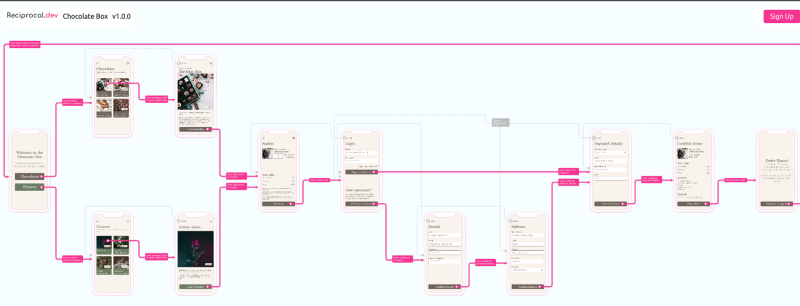
We started building the prototype by building an example application that Reciprocal.dev would use to create an interactive user journey map of and also to show off the functionality our product has to offer.

This example application was a simple eCommerce app but had territorial variants, worked on different device types, had different versions that introduced new functionality and had a split test running against it.
Because of a reasonably small set of concerns the app had compared to a real app, we were able to iterate over the functionality a number of times and focus in on improving the UX behind interacting with the map, instead of losing time worrying about mapping all possible data needs.

The smaller scope made it easier for us to use our analytics to understand how users were interacting with the prototype and which functionality they showed the most interest in.
We also added a ‘sign up’ button to the prototype to start building an email list of people who were interested in the product, which acted as an additional validation metric.
Making it
Even though the example app made it easier to think about the problem we were looking to solve with the prototype, there was still one aspect that I personally struggled with — my developer brain.
After over 10 years working in software development I’ve honed my brain to take a development task and think about all the interconnecting systems and data structures that might influence the way that task is completed.
I found myself having to fight my instincts when working on building the prototype so I could focus on building just enough to prove the idea and move forward instead of falling into Analysis Paralysis.
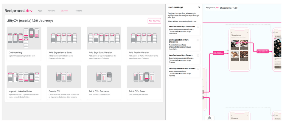
An example of this would be when we build the variants functionality into the prototype. Up until that point the prototypes state was relatively simple, but now we needed to track 3 different variants that could be combined with the journeys, layers and versions already in the prototype.
When faced with this problem my immediate thought was to sit down and start modelling data structures that would handle multiple variants in an scalable manner and then refactor the app to use this new data model.
This work would have taken weeks to complete, so in the end I reminded myself that the value this work brings isn’t that we have a solution for handling variants but to prove the idea out, so I ended up just using booleans to switch between a bunch of hardcoded data.
Once I’d refocused my efforts I was able to knock out the variant functionality in one night giving us more time to focus on iterating over the solution and build something that worked well enough to validate our hypothesis.
The outcomes
By realising the value lied in the validation of the idea instead of the way the solution was written I was able to build our prototype with all the features in about a month.
After the first feature — journey isolation — went live on the prototype we had our first sign up for the mailing list within a couple of days and since then we’ve had about a 1/20 conversion rate from those using the prototype which has been really reassuring that we’re onto something that people want.
It’s been a couple of months since we completed the prototype now and we’ve used the anonymous usage analytics to get a good understanding of what people use, which we combined with the feedback from user interviews into a prioritisation for building the product properly.
I think the difference in timescales for idea validation between the web app prototype for Reciprocal.dev and the mobile app for JiffyCV has sold me on never building another mobile app to validate an idea, instead I think, given the investment required for mobile apps, that it should be only to augment a proven idea’s offering.