Iterating my way to a product landing page via user testing with Maze
— Product Development, Design — 10 min read
While working on my side-hustle — Reciprocal.dev (a tool for visualising user journeys and annotating them development data) I realised that there was a higher level issue that gets in the way of teams being able to quickly build shared understanding (what Reciprocal.dev looks to do via it’s visualisations).
Teams that work on building software products, and especially those in larger companies where they may be specialised teams who only handle one part of the process rely heavily on specialised tools to do their work, but usually the other team members don’t have access to these tools.
Instead the other team members rely on a copy of the information that lives in the tools they use and that copy lacks any of the context that surrounds the original information such as links to other resources, notes about the decisions made or questions that have been asked.
An example of this disconnect would be:
- A product team who use a collaborative tool like Miro to work closely with customers to understand the pain points those customers face and how a set of features can make those customer’s lives easier
- A design team who use a design tool like Figma to create a series of screens that illustrate a user journey through an app based on the features the product owners have suggested
- A delivery team who’s Business Analyst takes exported images of those screens to add to a series of tickets in a work item management tool like Jira for the development team to pick up
- A development team who take those exported images and use them to implement the screens into the product by writing code using a development environment like Visual Studio Code and storing it with a version control management tool like Git, adding documentation and testing around that code and deploying that code for customers to use
- A support team who receive release notes and some documentation on how the new feature works who then build up their own set of documentation in a knowledge base tool like Confluence as they handle support calls about the new feature
While the team may be communicating well enough to get the requested feature built they are creating silos of information. As the teams communicate they extract the relevant information from these silos but it’s highly unlikely that teams one or more steps away from each other will share information.
Removing that disconnect
So after realising that such a problem exists I started to think about what technologies could be used to solve that problem and I settled on a graph database and built a simple proof of concept using Neo4J.
A graph database allows for a dataset to be built up around the relationships between the records contained in it and then those relationships can be queried in a manner that’s easier than doing so in relational databases (Postgres, MySQL etc) or document stores (Firestore, Couchbase etc).
The basic idea I settled on was to use the Graph Database to store links to different resources each team produces in their respective tools, and then map the relationships between in order to make it so any team could get a link to any resources related to the immediate resource they deal with.
An example would be, given I have the following records:
- A feature of the product that the product team want to build
- A number of frames in a Figma document the design team used to design the screens
- A user story in Jira that describes the feature to be built
- A number of functions and classes that implements the feature stored in Git
- A Confluence document with the support documentation
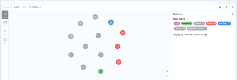
The relationships could look like:
- A design in Figma visualises a user story in Jira
- A user story in Jira defines a user’s interaction with a feature
- A function in Git implements a user story
- A support documentation documents a feature
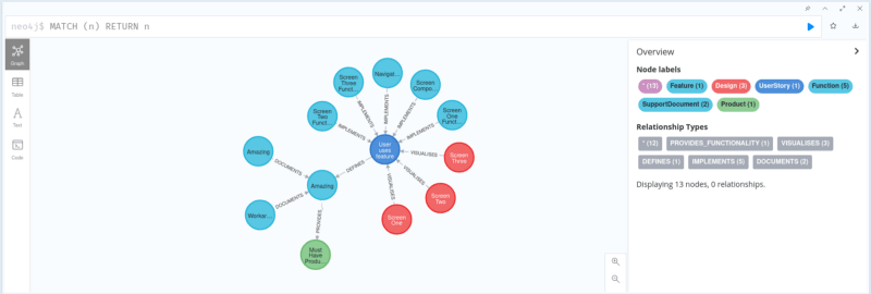
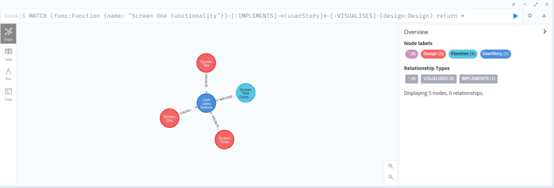
With those relationships created a query can then be performed to get all designs in Figma that visualise a user story in Jira that a function is Git implements.
Building an MVP doesn’t necessarily mean they will come
In my previous ventures into the world of product creation I’ve usually done a proof of concept to ensure that the product is technologically feasible and then jumped straight into building an MVP in order get feedback from those using the tool.
While really exciting from a development point of view (there is nothing better than having an idea and working through the night bringing it into creation) it’s not always worked out well in the long run as it’s a very labour intense way to see if an idea will actually be used by people.
My first stab at a product (JiffyCV) had a seven month gap between ideation and MVP, and while my second (Reciprocal.dev) was better at a month I soon came to realise a key part of the MVP isn’t just building the thing but also convincing people to use the thing you’ve built.
So with the new product (that I’m calling Clime) I decided to skip the MVP for now and focus on building a landing page to sell the idea first before I invest a lot of coffee, sweat and tears that may ultimately be a wasted effort.
Previously I’ve relied heavily on a small set of friends to help validate my initial ideas but I decided with Clime to take a different approach and use a user testing service called Maze to pay for feedback from a pool of testers and then use that feedback to iterate over the idea.
Using a user testing service made for a quicker turn around time for getting feedback, as instead of having to relationship manage and work around other people’s schedules I could spend an evening reworking the landing page, set up a test before I headed to bed and in the morning review the results.
The type of test I chose to use was a ‘five second test’ template which shows the tester an image of the page for five seconds and then asks them to answer some questions based on what they recalled from the image.
I ended up expanding the time the tester had to view the image to 20 seconds as I had a lot of content on the page and added a few more questions in order to understand if the tester was within my target user group and a true / false card exercise to see if testers came away with the view of the product that I wanted to communicate.
Iteration one
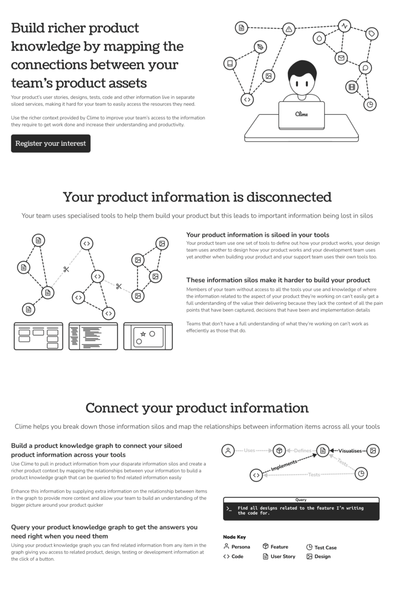
The first iteration of the design was essentially me attempting to squash all my thoughts about what the product represented into a page and hoping that the reader would be able to understand my intention.
Design wise I had taken inspiration for the layout from one of the templates that Gatsby (my go-to static site generator) has and added my own illustrations.
The monotone design of the Gatsby template helped me pull together a page relatively quickly as my illustrations didn’t have to include colour or shading.
Copy wise my intention was to give a summary of the tool, explain the problem that teams face and how the tool gives teams a means to solve that problem.
Iteration one feedback
As this was my first time using a user testing tool I was quite amazed at how quick the turn around time was and that I had additional responses for free, however after reviewing the content of those free responses they were essentially worthless, having been filled out by spammers or incomplete.
The feedback for the iteration one design was:
- Too much text on the page that made it hard to take in the concepts, given the short time frame the image was shown
- Text was too small, so given the amount of text it was hard to skim
- There was no clear benefit statement for why someone would actually care to use the tool, instead the copy stated what the product did
- The monotone design was considered really bland and unappealing
- Most people were able to sort the cards into the columns I’d hoped for, although this may have been skewed by 50% of the testers having a software development background
Based on the feedback I decided to tweak the landing page in the following ways:
- Add some colour to the page
- Remove half the text on the page so I can increase the font size and make it easier to read
- Reword the copy to make it more direct on how the problem and the solution impact the reader
Iteration two
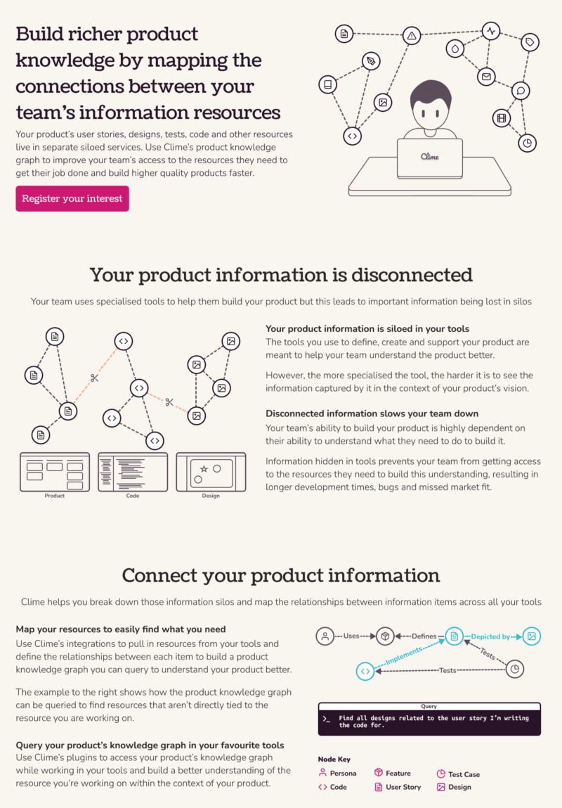
In order to make things a little more interesting I created a colour palette using coolors.co (a really nifty site, if like me you struggle with colour) and settled on a mix of magenta (primary), azure (secondary), orange (tertiary), black, a beige like colour and white.
I reduced the amount of text on the page by changing the tone of the copy to be more direct which allowed me to use less words as I was assuming that the reader knew of the background concepts I had tried to explain previously.
Iteration two feedback
It looked like in my bid to add colour I ended up negatively impacting the opinion of the overall design (I imagine it was the beige that did it) but the larger text seemed to improve people’s opinion on the readability.
The feedback for the iteration two design was:
- The design looked bad and wasn’t ‘modern’
- The font size made it easy to read by there was still too much copy to take in
- The images made it easier to understand the copy (this was interesting because the images hadn’t changed aside from a bit of colour but I guess maybe the text was more readable now so people could see the imagery complimented the copy)
- There was still no clear benefit for someone buying the product (I had made the copy direct but was still explaining what the product did)
- There was a similar level of success with the card sorting but the percentage of testers with a software development background dropped so I think this is a positive
Based on the feedback I decided to tweak the landing page in the following ways:
- Get rid of the beige background and replace it with something more ‘modern’
- Rework the copy to state how the product solves the problem instead of explaining what the problem is
- Make more use of imagery as that seemed to help back up the copy
Iteration three
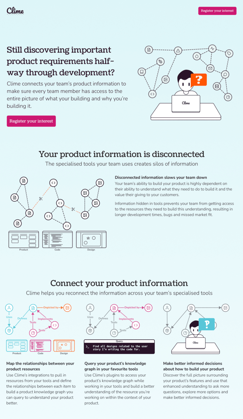
In order to make the design more ‘modern’ I changed the background to be a linear gradient from the secondary azure colour to white as this would keep the text readable.
I did a complete overhaul of the copy and updated the headline and subtitle to pose a question to the reader and then explain what the product does to solve the problem.
I removed more text in the problem section that I felt was ‘fluff’ and kept the main problem statement that I felt readers would care about (which in software development is always velocity because everyone wants everything delivered yesterday). I also increased the font size again as there was space to.
I turned the solution section into a story like structure by explaining the process the teams would take in creating their graph, querying the graph and then using the better access to information to build a better understanding of the product.
In order to make the solution section easier to understand I created a few more illustrations that show the same map being used across the different stages.
Iteration three feedback
With the beige background gone the opinion on the design shot back up into the “it’s OK” range and the new copy seemed to work a treat so I was really happy with the result.
The feedback for iteration three was:
- The design was OK (that’s good enough for me)
- The font size and slimmed down, direct copy made it easy to understand what the product offered (this iteration had the lowest percentage of testers with a software development background so I think this is more positive)
- The testers really liked the illustrations
- The card sorting was the most accurate it was of all the iterations
Based on the feedback I decided to start building the landing page properly as I was happy that the copy and imagery were good enough to start seeing if those visiting the site wanted to sign up for the product.
Building the landing page
To build the landing page I fired up my usual set of tools for building landing pages:
- Gatsby for generating a static site based on React components
- Netlify to manage serving the static site and DNS for the domain name
- Mailchimp for providing a form people can complete to sign up for product updates
- Posthog for analytics so I can see how many people visit the site and how many click the button to sign up for updates
Converting the design in Figma into a webpage was relatively simple as I just had to work through the design section by section and use a CSS grid to layout the mix of imagery and copy.
In order to make the design responsive for use on mobile I could just change the display type of the grid element so that the content was shown vertically instead of horizontally.
The illustrations I did in Figma work well with the responsive design as I exported them as SVG so they’re scalable which means they look crisp regardless of the size.
The decision to build the site in Gatsby instead of building a single HTML file was based more on future-proofing than anything else as Gatsby allows me to pull in information from other sources like a CMS in order to create pages which we’ve used for the Reciprocal.dev website.
After a couple of hours spent building the site I was able to get it launched and I think doing all the validation of the copy and images using Maze instead of trying to write the copy while building the site was a contributing factor to how quickly it came together.
Summary
The final landing page is now available on https://clime-app.com if you want to check it out and sign up for updates.
Using Maze really helped me to not only refine the copy and imagery of the site to make sure the concept was explained clearly but also to help me understand what the product I’m looking to build is.
By having to iterate over the description of the problem and the way the solution solves that problems it’s allowed me to hone in on the key aspects of what that solution offers which will make it easier to set a scope for the MVP (if the landing page generates a good level of interest).
Overall for the three tests I ran on Maze I spent about £115 to have 15 testers look at the design each iteration.
This might seem like a large amount of money to put down when it costs “nothing but time” to build a HTML page and serve it over Netlify’s free tier but I’d argue that the number of hours it would take to gather feedback on that page and iterate to get to the same level of confidence would be far more expensive than that initial £115.
Should the concept fail to get people excited than I’ve only lost £115 instead of the tens of thousands I’d have lost if I calculate my hourly rate at my day job into the time I spent building the JiffyCV MVP and landing page.
If people love the concept and show enough interest that I decide to proceed with building the MVP then that £115 should hopefully get reimbursed relatively quickly.
Let me know your feedback
If you enjoyed this post I’d really appreciate if you could tell me what you think of the concept behind Clime and if you think it’ll help your team build a better shared understanding efficiently.